THE MERCATOR EFFECT
Why Africa Looks Small on Most World Maps
Africa looks small on many familiar maps for a mathematical reason: Mercator stretches the world more and more with distance from the equator.
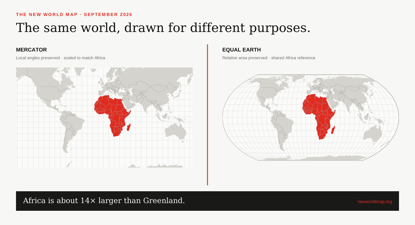
The distortion is in the comparison
On a Mercator map, scale is true only along selected lines and grows rapidly toward the poles. Africa spans the equator, so much of it receives relatively little enlargement. Canada, Russia, northern Europe and Greenland sit at higher latitudes and expand across the page.
That distinction matters. Saying ‘Mercator shrinks Africa’ is an understandable shorthand, but the more precise explanation is that Mercator disproportionately enlarges land farther north and south. The viewer then judges Africa against an inflated visual reference.[1]
Why Mercator was built that way
Gerardus Mercator’s 1569 projection preserves local angles. A navigator can plot a constant compass bearing as a straight line, a remarkable and practical property for its original purpose. The cost is that the map’s scale cannot stay constant across latitude.
The projection’s continuing use does not make it fraudulent, and replacing it everywhere would be a mistake. The problem comes from treating a navigation tool as a neutral picture of continental size—especially in classrooms, news graphics and global comparisons.
Why the image matters
A world map is often encountered before a person has learned to question projections. Repetition gives its silhouette authority. The African Union’s Correct the Map campaign argues that a continent shown with diminished visual weight can reinforce outdated ideas about marginality, even when viewers know abstractly that maps distort.[4][5]
The UN General Assembly’s September 2026 resolution turned that argument into a global education question. It encourages maps that preserve relative area when size is the subject, while recognizing that different projections remain appropriate for different purposes.[2][3]
A quick way to see the effect
Compare Greenland and Africa in the linked map. Keep the viewport matched, then look at the red screen-footprint values. On Equal Earth, the footprint ratio follows geographic area. On Mercator, Greenland’s high latitude greatly increases its apparent share of the panel.
Then try Indonesia, Brazil or the Democratic Republic of the Congo against a northern country. The point is not that one outline suddenly becomes perfect. It is that the map’s visual emphasis changes predictably with the mathematical property it preserves.
SOURCES & REVIEW
Sources for this article
We link to primary institutional material where possible and keep projection-dependent screen area separate from official statistics and boundary-derived geodesic estimates.
- UN Statistics / UNGEGN guidance on choosing map projections ↗
- UN General Assembly draft resolution A/80/L.104 ↗
- UN General Assembly, 80th session, 114th plenary meeting ↗
- African Union Assembly Decision 959 (XXXIX), February 2026 ↗
- African Union statement on the adoption of the Correct the Map resolution ↗
- United Nations Statistics — surface area data ↗
Published 2026-09-08 · Last reviewed 2026-09-15. News and institutional claims were checked against the cited record on the review date.
Read our method and editorial standards →