AREA, NOT APPEARANCE
The True Size of Africa on a World Map
Africa covers about 30.37 million square kilometres. That is roughly fourteen times Greenland, a little over three times the United States, and more than nine times India.
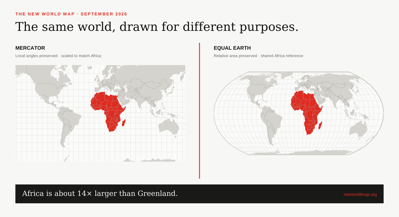
Africa and Greenland
The comparison is memorable because Mercator makes the two landmasses look surprisingly close in size. They are not. The African Union gives Africa’s area as about 30.37 million km², while UN Statistics lists Greenland at about 2.17 million km². Dividing those figures gives a ratio close to fourteen to one.[1][2]
Greenland is pulled across a much wider band of the Mercator map because it sits close to the North Pole. Africa straddles the equator, where Mercator scale is least inflated. Equal Earth assigns both regions map space in proportion to surface area.
Africa compared with large countries
The United States has a total surface area of about 9.83 million km², including inland water, so Africa is a little over three times larger. India is about 3.29 million km², making Africa more than nine times larger. China, the United States and India together still do not equal the whole continent.[2]
These are comparisons between a continent and countries, so they describe scale rather than political equivalence. Africa contains 55 African Union member states and an extraordinary range of climates, languages, cities and landscapes; a single outline should not flatten that diversity.[1]
Africa and Europe
Africa is about three times the conventional geographic area of Europe. The comparison is necessarily approximate because Europe’s eastern boundary is a geographic convention rather than a coastline, and published totals vary depending on how transcontinental states and inland waters are counted.
Mercator expands northern Europe while leaving equatorial Africa closer to base scale. The visual gap between the two therefore looks much smaller than the area totals suggest. That is one reason equal-area projections are better for a world map intended to teach continental scale.
How this map calculates area
The official figures shown in the article are references from the African Union and UN Statistics. The interactive tool also calculates a geodesic estimate from the boundary geometry currently drawn. It labels the two values separately because coastlines are simplified at world-map scale and disputed boundary conventions can affect polygon totals.
The red screen-footprint figure is different again. It measures projected pixels inside matched panels. Use it to study projection distortion, not as a replacement for an official area statistic.
SOURCES & REVIEW
Sources for this article
We link to primary institutional material where possible and keep projection-dependent screen area separate from official statistics and boundary-derived geodesic estimates.
- African Union — African Union Handbook 2024 ↗
- United Nations Statistics — surface area data ↗
- Natural Earth 1:50m cultural vectors ↗
- Mapping for a Sustainable World — United Nations and International Cartographic Association ↗
Published 2026-09-08 · Last reviewed 2026-09-15. News and institutional claims were checked against the cited record on the review date.
Read our method and editorial standards →